Quantcast
Channel: The Vintique Object
Viewing all 102 articles
Browse latest View live

A few recent projects...

$
0
0

 We have recently completed a few fun new projects for our business, Claremont Finders Keepers


The first is this chalkboard door, which was inspired by Lane's and sold as a custom order to a customer who found us at the recent Alameda Pointe Antiques Faire.


Here's what it looked like before:


We also recently finished a custom order to redo some nightstands for two little boys.


We found the whale tail pulls at Anthropologie and couldn't pass them up. 

And here is what the nightstand looked like before it got a makeover:


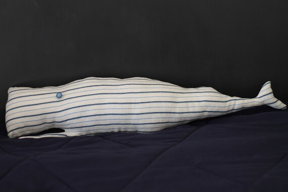
Speaking of whales, we've got a few freshly sewn whale pillows listed on Etsy.


And last, when we spotted the idea to make wine cork key chains on Pinterest, we had to give it a go. 


See, we have a huge bag of corks from Toast, a fabulous wine bar around the corner from us.

via
(Had to include this photo because the interior is so cool!)


Anyway, they even float!  How's that for a novelty item?


Sadly, we got to sell nothing because our planned studio sale had to be rescheduled to the 15th due to rain.  It has been pouring for three days here in the Bay Area -- very typical winter weather for a place that never freezes.

It is a strange thing to bundle your kids in raincoats, boots, and umbrellas before going out into the December weather.  And this desert girl hardly knows what to do when she finds moss growing on the sidewalk!

Regardless, it's good weather for staying inside to work on some fun new projects. 


Laura's House Tour Part I

$
0
0


So excited today to share a tour of a house oozing with vintage charm and character in Oakland, California.  Homeowner, Laura, is a studio floral designer, friend, and sometimes my boss when she hires me to help during wedding season. 


Come on in!


As you walk into the 1922 Craftsman style house, you enter the dining room, complete with built-in window seat, leaded glass china cupboard, and fireplace. 

Laura says it felt immediately like home, even before she saw the inside. 


Most of the original features are intact.  Laura says that she has done minimal work to the place -- only updating it with a bit of paint. 

An avid collector, Laura has been visiting flea markets since she was 19.   Many pieces of her collection are used for floral design, and a lot of what she has was once in the flower shop she owned in L.A. before moving to the Bay Area.

This bookshelf once resided in her flower shop, but now holds most of her photos.  Laura says that because her house is small, she prefers to keep them all in one place and mix them up with other things that have special meaning, like sand and beach glass from Hawaii, and special treasures given to her by her nephew.


She has also been a long-time collector of globes and vintage cameras.  


Just off the dining room is the living room. 


The painting is a flea market find and most of the colors in Laura's house are intuitively pulled from this single piece.  

Here is another amazing collection of yellow and green pottery housed in an old lawyer's bookcase from Laura's dad.  The coffee table/chest is from her grandmother. 

Laura is a master at creating vignettes.  This is a little grouping full of bits and baubles she liked with a spur from her horse-riding days.

 
Laura tells me that she doesn't know where her obsession for vintage clocks came from.  She has them all over the house, including wall clocks with dangling cords.  People often ask her why they aren't plugged in, which amuses her as much as people's reaction to her doll parts, like the legs you see in the bird cage. 
The kitties have found a sunny spot in the living room. 


And here we are looking back into the dining room again.

On Friday, I'll show pictures of the rest of Laura's house.  Hope you've enjoyed part 1 of the tour, and be sure to check out Laura's website to see photos of the stunning floral work she creates for weddings. 


Laura's House Tour Part II

$
0
0


If you missed part 1 of Laura's house tour, you can click here.


Today we're starting in the dining room again.  The beautiful, ornate hall tree belonged to Laura's dad.  A perfect place for a terrarium filled with air plants.  To the right is a peek into her office.  


And here is Laura's office, where she stores columns and large urns for wedding work.  The yellow bunting is made from dyed cheese cloth strips attached to rope -- a technique she sometimes uses for wedding decoration. 


Another of Laura's beautiful displays.


Rope, an old pair of scissors, and a straw hat.  What more do you need?

Laura recently hung this old wooden tool box on the wall to house little collections of things.  What a great idea!

Another globe in her collection. 

As you come out of the office, you head into the kitchen with its painted white and black checkered floors.  That sink in the back is part of the butler's pantry, which I will show in a minute. 

Laura had open shelves long before they became popular.  The back splash is stainless steel and the counter tops are butcher block.


She is the only person I know, besides my mom, who can get their orchids to re-bloom.


I love how Laura took advantage of that bit of wall space to use a stainless steel cart for eat-in-the-kitchen meals.  It also makes a great place for guests to hang out while Laura cooks.  (Note the wall clock with hanging cord I mentioned in part 1.)  To the left, you have another peek into the butler's pantry.

The name "butler's pantry" cracks Laura up.  She says that in a 1000 square foot house, who needs (or can afford) a butler?   Still, it is full of vintage charm with the wall faucet and built-in cabinets.  The skirted under sink space also makes for a nice place to tuck the kitty litter box. 

The tile on the counter tops is original, and you can see more of Laura's pottery and glass collection on the open shelves.

And finally, Laura's bedroom. 


Laura is a studio floral designer, meaning that she works in a studio rather than a shop.  Here she is in the door of her garden shed which acts as her studio.  I wanted to get more photos of her garden and of the inside of her studio, but ran out of time! 


Thanks, Laura, for allowing me to take pictures of your adorable home!

Hope you all enjoyed the tour. 

Round Dining as Side Table

$
0
0


It all started with this photo of designer Kelly McGuill's home, which was recently published Yankee Magazine. When I saw this photo for the first time, I had just finished reading some interior design rules about side table and lamp height.  Kelly ignored and/or broke those rules when she put this pedestal dining-sized table and overscale lamp next to her sofa.
(I am ga-ga for this neutral living room and feel the same way about her entire house.  Click photo to see more on her blog O so D.)


And then I started to notice dining-sized round tables being used as side tables in all kinds of interiors. 


Source:  Cottage Style Fall/Winter 2012

Source:  Cottage Style Fall/Winter 2012

They are a great way to fill space in a large room or corner, and look especially nice next to a sofa.

I had never considered using a round dining table as a side table until I saw that first photo.  Had you?

**Click photos for sources, unless otherwise noted.

Love this table!

$
0
0


I was just perusing the World Market website and found this little beauty on sale for $150.  Not a bad price.  If I didn't already have three dining tables in my teensy-tiny place, I'd snap it up.  

Oh, and they've even named it after me.  ;)

Camille Kitchen Dining Table from World Market.

Nope, they didn't pay me to say this.  

We're opening a shop!

$
0
0
quick iphone pic


Big news!  My biz partner, Wendy and I are finalizing the details to open a real storefront in a great little area called Temescal Alley in Oakland.  We'll continue to sell our refurbished and upcycled goods for the home there and on etsy. 

We had been dreamily talking of opening shop sometime in the next few years, but when we found out about this amazing vacancy two weeks ago, we took a leap of faith and went for it.  

At the turn of the century, our little (emphasis on little) shop was originally a stable.  Later the horse stalls were turned into carriage houses and most recently into tiny shops.

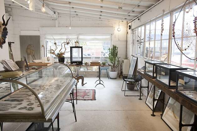
Here's what the inside looks like.

quick iphone pic
We love the exposed brick, the built-in rustic pipe shelving, and the concrete floors. And of course, we plan to do some work to make it our own.


via San Francisco Chronicle

We couldn't be more thrilled to be a part of this thriving community of small shops full of artisans and other creatives. 

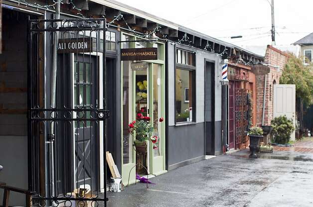
Here are what some of the other shops in Temescal Alley look like:

Esqueleto via The San Francisco Chronicle


Crimson Horticultural Rarities via The San Francisco Chronicle

Doughnut Dolly -- image via Refinery 29

You can see we have our work cut out for us! 


To read more about Temescal Alley, see The San Francisco Chronicle's recent article "Oakland's Hip and Vibrant Temescal Alley Takes Off."

One last thing, since our business is no longer located in the Claremont area of Oakland, we've decided to change our name.

Henceforth it will be "Walrus."

We have changed the blog title, and are working on changing our blog address to match.  And we'll probably have a new website up and running soon.

Details to come!  We are uber excited!

"Soft" opening on Friday!

$
0
0


Newly made sign ready to hang over our shop door -- being sent home with my husband on the airplane today in time to hang for the opening! (Thanks for donating the old cabinet shelf for the sign, Mom)


We have been hard at work getting our new shop ready for its "soft opening" this Friday.  Although I've been doing small bits of work from New Mexico, while Wendy has done the bulk of the work in Oakland.

You might remember that I've gone to my home state to be with family during Christmas.  This was especially important because of two recent terminal cancer diagnoses in my family.  We lost one family member the week before Christmas and spent a very bittersweet last Christmas with the other.

In my stead, my friends have jumped in to donate their time and talents in helping Wendy get the shop ready for the Temescal neighborhood's First Friday  (I literally signed and overnighted the lease two days after we arrived in New Mexico!)

Want to see what they've been hard at work doing?  (I can hardly wait to see in person myself!)

Our shop doors and trim got a fresh coat of bold yellow paint.

Away went the pale blue paint in the interior.  One wall got a fresh coat of white.  And the vintage brass chandelier I posted about ages ago got rewired and hung.


The opposite wall got covered in chalkboard paint and I can hardly wait to get my hands on some chalk to decorate it.  The green ladder is one of our hand-made quilt ladders.

These vintage drawers got a new home attached to the wall to hold our merchandise.

And this pegboard got hung and arranged with vintage tools until we can replace them with the artisan tools we plan to carry.

The window boxes got planted with easy-to-care-for succulents.  (It never freezes in the Bay Area, so these will winter well outside.)

I owe a huge thank you to my sweet friends for being there for me when I can't.  I am so grateful to:

Monica
Melissa
Lane
Laura
Natasha
Kara

Thank you too, to Shems who drove up from L.A. for a few days and to the folks at Hacker Moms for donating their time and expertise.

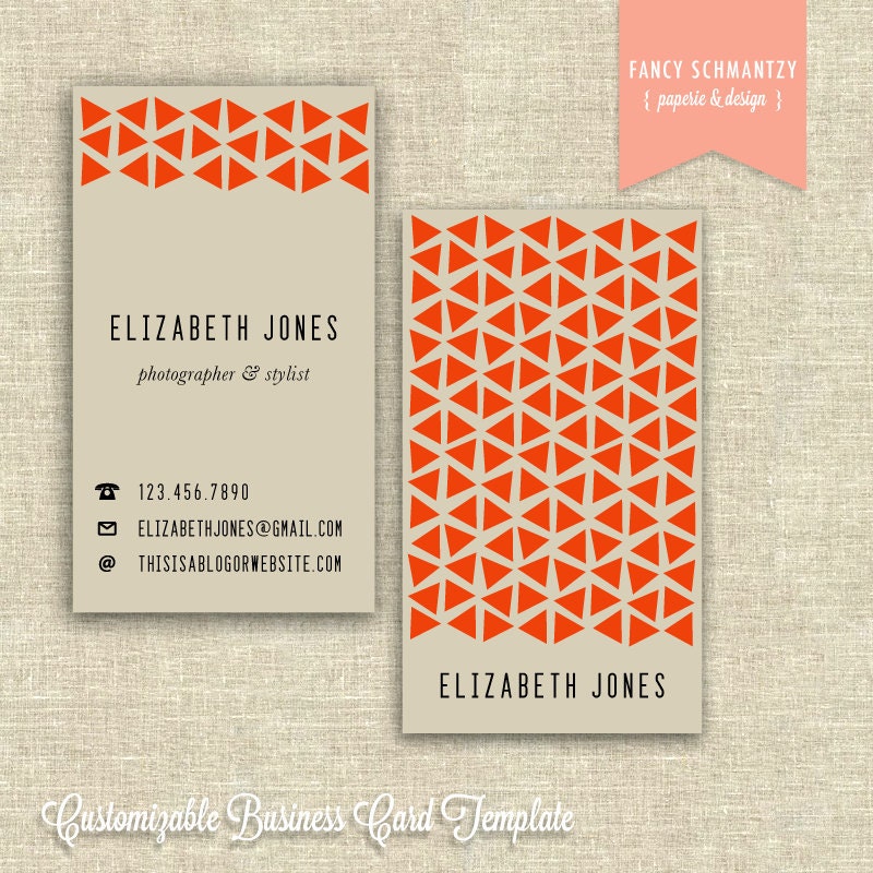
I also want to mention graphic designer Mitzi of the etsy shop Fancy Schmanzy.  She came through with a business card design for us less than 24 hours after we contacted her.  This after not hearing back from five other graphic designers we contacted in the last two weeks.  (We understand, it's a busy time of year!)

We bought this customizable business card template:


Business Card Template

It's pretty cute, huh?  And an amazing deal at $20.  We'll definitely be using her to design a custom logo and new cards for Walrus.  Check out her other work here.

And how can I forget to thank Wendy who has been working herself to the bone, even when she's been sick, to get the shop ready and keep producing inventory so that we have something to sell.  Wendy, I couldn't ask for a better business partner.  You have my eternal gratitude and deserve a big vacation when I get back.  
And last, for those of you who are local, Wendy would love to meet you on Friday night.  Come see the shop before I do!


Temescal First Friday Art Hop with featured artist Kevan Jenson.
Friday, January 4th from 6-9pm
470G 49th Street, Oakland


When it works, repeat.

$
0
0


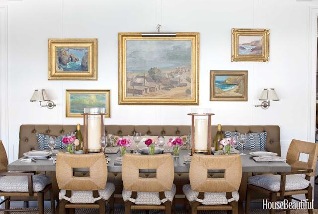
When I spotted this photo on Pinterest the other day, I knew immediately who had designed the space, even before I read February's issue of House Beautiful.


Peter Dunham, of course.

Not only am I a big fan, he also designed one of my favorite dining rooms ever:


Correct me if I'm wrong, but I believe this second picture is from Dunham's own house.  If I remember, he picked up those chairs at an estate sale.  They are slightly different than the those in the first photo, and as I know Peter Dunham has his own line of furniture, I'm wondering if they are not reproductions?

Anyway, note also the use of the tufted, olive banquette.  In the HB article, which I pored over, Dunham says he used outdoor fabric to upholster it.  He added that when you tuft any kind of fabric, it automatically elevates the look.  Hmmm.  Food for thought.

If you have the newest issue of HB, get it out.  You'll see other little repeats from his own dining room in the new article.  

So yeah, when it works, repeat. 


Ladders

$
0
0


This last photo is a sneak peek of an upcoming house tour from the home of one of our clients.  That's one of the custom built quilt ladders we just completed.

Can't wait to show you the rest of the crazy-good, eclectic house next week.  

P.S.  To see some photos of the inside of our new shop, click here.


Eclectic House Tour

$
0
0
I recently went to the home of one of our clients to take photos of a few projects (like the refurbished rocker you see on the porch) we've recently completed. I was so blown away by her house, I asked and was granted permission to take photos for a house tour.

 
This coyote howling at the oval mirror moon is what greets you as you walk in the front door.  It's just a taste of this colorful, personality-filled Craftsman era house in Oakland, California.


From the entry hall you are led directly into the dining room:

 The eyeglasses on the wall are from an old optometry shop.  I covet them.  I think every formal dining room needs a pig on the table too.

You may have seen this photo in a previous post, but our client ordered this custom ladder for her quilt collection.  Is that not the best wallpaper you've ever seen?


From the dining room, you enter the eat-in kitchen with this little seating area at the end of it. 

And here we are looking in the opposite direction.

A peek from the eating area into the kitchen.  Yes, that's a huge glass of milk you see on the wall.

Ding! Order's up.


As you exit the kitchen from this doorway, you are led back into the entry hall.  I opened that little door on the left to show you that they have a dumbwaiter.


And just a little further down the hall is the elevator.   The sign above it says "lift."

On the other side of the entry hall is the living room.  This is the view you get as you walk in.


If I had to pick a shelter magazine to match the style of this house, it would be Elle Decor.

I love this turquoise painted sunroom at the end.  Our client painted the ceiling gold. Which echos the huge gold coffee table in the living room.  We're not in prime bouganvillea blooming season here in the Bay Area, but you can probably imagine that vine you see through the windows bursting with hot pink blossoms (called bracts) in the summer. 

Let's head back to the entry hall and go upstairs.

Here we are in the upstairs hall with some of our client's gorgeous collection of rugs and more huge art.

I've said it before, but I adore bathrooms with vintage tile.  I'm so glad they haven't redone this bathroom.  It's perfect.  How cool as that mirror on the floor?

A beautiful display of jewelry in the bathroom, which is big enough to put a piece of furniture in.  You don't find that much these days...

The master bedroom.

My favorite shot of the bunch.  Her textile collection is unbelievable. 


And finally a shot of the powder room back downstairs.  I do love a teensy corner sink.

Here's the pretty scene just above the sink in front of the window.

There are a number of other rooms in this house, but I didn't include pictures of them all, though they were just as creative and collected.

I love seeing an historic house filled with treasures and fearless decorating.

I hope you are inspired to put a huge glass of milk on your wall. 


Twin Beds for the Guest Room?

$
0
0

We had guests this weekend.

My girls' room
In our two bedroom place, we put guests in our twin girls' room with the twin beds.  (The girls sleep in sleeping bags on our floor of our room and love it.)


Twin beds are kind of ideal for a guest bedroom because it's easy to accommodate a non-couple.


And it's certainly possible to remove the "little kid" feel of twin beds if you want something more sophisticated.

This room feels a tad girly, but it's still grown up and I love how the headboard wraps the corner to make the bed seem like a chaise.


Regardless, there's something so pleasing about the symmetry of two matching beds.  How great are the benches at the end?  The perfect spot to put a suitcase.

I like the ledges built-in ledges behind each bed here.

An L-shaped arrangement is perfect for a sleeping porch, but takes up very little visual space in any room.

I adore this rustic twin bedroom.

This one is a favorite too.

The one down-fall to twin vs. a double or queen bed is that there are two sets of sheets and blankets to change and wash rather than one. 

And I do have a lingering question:  If you were staying as a couple in a guest bedroom with twin beds, would it bother you?


A Cozy Guest Room

$
0
0

To follow-up on my previous post about guest bedrooms, I thought I'd post this handy-dandy visual I found sometime ago on Pinterest.  

If I were to give myself a grade for the quality of our guest bedroom (aka my girls' room) based on this chart, it would be a big, fat F. I've got numbers 2,3,5, and 9, so that's four out of thirteen.  There's definitely room for improvement!


Unusual ways to store dishes.

$
0
0


The above photo inspired our latest project at Walrus

 When we found an old, wobbly bookcase, we nailed scrap wood boards to the front to shore it up and simultaneously provide some space for labels.  After white-washing the entire piece, we added the burlap skirt and burlap covered backing.  The burlap is from old coffee bags that we get locally.


The chalkboard labels are simply our old business cards which we paint.  (We use this method to make re-usable tags too.)  We love recycling!  The only thing new in this project are the label holders and believe me, we tried to find the vintage variety locally, but struck out. 

This piece is meant to sit on a counter top, sideboard, or table and to be used as a kind of pantry or for dish storage.  I kind of want it for myself.  :)
 

<click on photos for sources>

Some Favorites

$
0
0

Hello Friends!

Just checking in since I didn't have a chance to do two posts this week like I normally like to do.  So while I have a few minutes today, I thought I'd share some photos of interiors that I've been drawn to lately.


 This is photo of the Fat Radish in NYC.  Love the leather handles on the cabinets and look how the map is hung.  Had it just been tacked up as a poster on the tiled wall, it would not have nearly as much presence.  You've got the texture of wood, rope, and iron to add to the pattern and color of the map.  I think I might try to duplicate something like this in our shop.


Guess I'm really loving maps and worn wood lately...


When I pinned this photo with the description "sink on the side" my sister commented that it would be a awkward to use.  Well, I can see her point.  But I have to say that I enjoy seeing spaces used differently.  Look how the pendants are hung too. 


I'm pretty in love with this pantry.  It reminds me of something you'd find on an old sailing ship, minus the breakables up on shelves, of course.

I'm sure many of you read about these vintage school house stools found on 1st Dibs for House Beautiful's Kitchen of the Month.  The island was designed around them so that they tuck under.  As a mother, I really can't think of a more practical choice for cleaning up the floor underneath.

So, I'm putting it out to the world:  Pottery Barn, Restoration Hardware, Ballard Designs, you all would be wise to duplicate and manufacture this stool.  And for that matter, an island they could safely attach to.  I think they'd sell like hotcakes.


Moving away from kitchens, this is one I've been meaning to show for awhile. I'm pretty sure those are coffee filters on the wall.  I really like them.

And that brings me to the point of this post -- coffee filters in decorating can be a bit too sweet, frilly, or cutesy for my decorating taste.  Rustic/country can really easily run in two different directions and I'm finding I'm much more attracted to the more serious, spare, and modern (and neutral) variety.  Which I'm sure is evident in these photos. 

It's been such a busy few weeks.  I'm really missing reading and commenting on blogs and am hoping to get some time to do that this weekend. 

Hope you all have a great weekend!

Camille

<click on photos for sources>

Interview

$
0
0


My business partner and I were thrilled to be recently interviewed by the talented Lori Fuller of Lori Fuller Photography for her blog.  She's doing a new series focusing on small businesses. 

To read more and see the beautiful photographs she took of our eclectic little shop, click here

Collections

$
0
0


 I ordered and just received this book in the mail.  It is fascinating and has gotten me to think more about the process and beauty of collecting.  Collections of things can easily take a wrong turn unless done in a defined and intentional way. 

I don't really collect many things, but I have started a new collection based on something I found and loved this summer.  I'll show pictures in my next post.

<click on photos for sources>

Tea Height

$
0
0
via
via
via

via

via

via


All of these coffee tables have one thing in common -- they are all at tea height.  It's really just a fancy way of saying that they are taller than the typical coffee table, which usually sits at or below seat level.  Perhaps we should call them a tea table instead? 


In this photo of my living room (taken ages ago) you can see that our coffee table stands at tea height.  It belonged to my grandmother, and supposedly it once stood as dining table until she had it cut down.  (We'd had it only a matter of weeks before my girls started to ruin the top, so I promptly "upholstered" the top in pleather --which has held up beautifully to all manner of abuses.)

After having lived with both varieties of coffee table, I thought I'd list the pros and cons of the tea height.

Pros
  • easy for entertaining as you don't have to reach far for your drink
  • or plate of food if it's a casual get together -- you can literally eat off the thing
  • perfect for watching videos or shows on a laptop
Cons
  • not comfortable for propping feet on 
  • takes up a lot of visual space in a room
That last part is one I've been meaning to do a post on -- how tall furnishings can hinder (or help) with the feeling of space.  I'm going to have to do bit of scouring to find photos that will help me prove my point, though.  So it may take some time.

I've given thought to chopping my grandmother's tea height coffee table down a bit.  Quite frankly, I'm more into comfort and casual living than formality.   And since my grandmother had no problem chopping the legs down on an antique, I figure I can do the same.

**In my previous post, I said I was going to show you pictures of my new collection, but I'm feeling too lazy to upload and sort throughmy photos just now. :)


Top Five Favorite Living Rooms

$
0
0


I've been thinking about doing a series like this for sometime now --listing my top five favorite images for each room of the house.

I think I'll start with the living room today.  Here are the photos of living rooms that I fell in love with instantly when I saw them.  The kind I'd be happy to have in my own house.


I think this one is probably my favorite of the bunch.  I adore the bright, white walls, the relaxed vibe, the stripes on the chairs and the yellows and blues mixes together.  There is more pattern that I might normally use, but I do love it here.  It has just the right touch of wood and warmth to balance the cool white.  The beams on the ceiling and the fireplace shape are perfect.  And there is just enough asymmetry in the decorating to throw the symmetry of the room off a bit.  It feels cozy and casual and anything but pretentious. 


I wish there were wider angle views of this room (there is another photo, which you can see here), but regardless, I love everything I see.  The overscaled illustration, the casual/natural feel of the furnishings, the gorgeous warm brass sconces, the bright white walls with tons of contrast, even the pattern on the navy blue pillow is fabulous.  A room full of texture.


Are we sensing a theme?  Love the tones of green and blue (with some orange/yellow warmth) the wood, the fabulously asymmetrical overscaled art.  How the floor lamp on the left balanced the art on the right.  And the painted brick is pretty awesome too.

Just as an aside, I do wonder if we are drawn to rooms that feel familiar to us.  For the longest time, white walls seemed anything but acceptable in the decorating world (at least it was repeated over and over again in magazines), but I've always loved them.  And I think it's because I grew up with bright white walls in house filled with light.  My mom painted a huge wall of brick like this in our living room, and we always had wood antiques, which I think think are divine against white.


LOVE.  Jessica Helgerson designed this one and she remains one of my absolute favorite designers.  The eel traps above the fireplace are pure genius.  In fact the entire room feels a bit sculptural, doesn't it?  Not a single antique here, but lot of mid-century stuff.  Which surprises me since I have very few mid-century pieces in my own house.  Then, again, I grew up in mid-century built house, so maybe that's where this love comes from.  Anyway, I'm not sure I'd love to get comfy in this room, but it is beautiful nonetheless. 


This is one I was delighted to find on Pinterest, as it had been a tear sheet from Cottage Living years ago.   This room feels so current, yet I think it was featured at least five years ago, maybe more.  I remember that it is a California cottage.  I love the rustic wood, the bright white walls, the casual feel of the sofa (I think there's another parallel to this one), and the contrast with touches of black and dark wood.

I think it's important to realize that our tastes can evolve too.  Below is a living room that I still love, but it doesn't land in my top five anymore.


Oddly, this living room (also from Cottage Living)  is probably more similar in style to my current living room that the aforementioned photos with its dark antiques and floors, classic architecture, beige sofa...


If one pays attention to the advice of magazines (which were my main source of decorating advice before blogs and Pinterest) one might feel the need to follow someone else's rules about decorating.  Use lots of color!  Neutral is boring!  Introduce varying patterns in different scales!  Well, folks, I've come into my own when it comes to decorating and I'd say it's clear what I love. Neutrals; lots of natural texture; balance of symmetry and asymmetry; a few overscaled pieces; wood tones against white walls; smalls bits of color in greens, blues, and yellows; very little pattern; and lots of contrast. 

But it took years to get here.  To get to a place where I can identify what I think it good decorating and beautiful for another's house, but not for my own.  That's the key, really.  We can admire a style, but how do we differentiate that from our own?


Comfy Kitchen

$
0
0

This kitchen is maybe a bit fancy for my taste but there are a few things I'd like to point out about it.  First,  look at the armchairs adjacent the island.  Maybe it's because I often feel isolated while I'm cooking, but I'd love for my husband or a friend to be able to settle in next to me while I'm working.  And somehow it feels more comfortable to sit in armchairs than at a bar.  With kids in the house, the armchairs would  probably need to be slip covered, but still, it's a beautiful idea. 

Second, I love how the coffee bar is separated from the rest of the kitchen.  No need to interrupt what's going on in the cooking area to pour yourself another cup while lazily reading the paper in those armchairs.

Third, if the floor of the kitchen were stone or tile, it would feel a lot less warm and inviting to sit in the armchairs, so I think the choice of hardwood is perfect for the space. 

Another one to tuck away into the files of "someday kitchen."

Hope you've had a good start to your week, Everyone. 

Look Alikes XIII

$
0
0


My friend, Lane, has accused me of having a photographic memory for interiors, and I think 
she might be right.  

It is a completely useless skill.  

Why can't I, for example, remember the exact copy of a text book page?

Now that would be a good skill to have. 


Anyway, I just came across this living room on Pinterest and followed the link through to find what I suspected.  The design is from the L.A. firm Nickey Kehoe.   What tipped me off is the stool on the right.  It's pretty unusual, isn't it?


You might remember it from this House Beautiful photo featuring a Nickey Kehoe design project.  Upon closer inspection, I realized that the first photo was taken in the same house.  What other similarities can you see?

Here's another recent look alike that started on Pinterest. 


This one comes from Flourish Design + Style.  The blogger/desiger, Sarah Swanson, is quoted on this page of the Hinkley Lighting catalog.    There is no way I could forget that gorgeous black window and the double sink console. 

I knew just where to find it -- on my Pinterest Bathroom board:


Oh, look at that!  The sconces were changed for the Hinkley catalog.   I think I like the Hinkley ones better.

And I also never knew, until I saw the first photo, that the mirror hanging against the wall is an inlay mirror.  I'm a huge fan of inlay...

Speaking of which, I'm embarking on my third inlay stenciling project soon (see first and second here).  This time it will be a small two-drawer chest and we'll be selling it on our shop.


By the way, the above bathroom is probably in my top five favorites.  Which reminds me that I'd better choose another room for the next in my series.

Hmm, maybe it will be the bathroom...


Viewing all 102 articles
Browse latest View live